Ranking All 32 NFL Teams Helmet Logos From WORST To FIRST At The End Of 2023 Season

i
It’s sad to see the 2023 NFL season go, but we have the 2024 season to look forward too.
NFL franchises are all about their brands nowadays… And one critical feature of that brand is the team’s helmet logo.
Unfortunately, not every organization has got that part of the equation figured out.
Is your favorite team among that group? Let’s find out as we rank every team’s helmet logo, from worst to best!
32. Washington Commanders
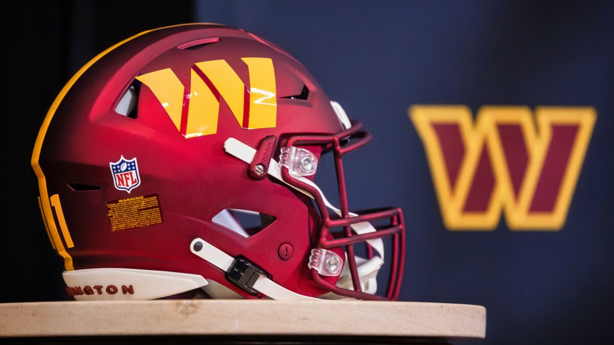
I suppose it shouldn’t be a shock that the Washington Commanders have the worst helmet logo in the NFL—bar none. After all, they are pretty regularly the worst… On the field, in HR trainings… Of course they wouldn’t be able to design a proper helmet logo!…
Even with all of the practice that they’ve had rebranding multiple times in recent years, the best they could muster up was a big, yellow W—in some horrible bland, post-modern looking font.
The suits in DC are up to their ears trying to figure out if Dan Snyder is going to get booted from the league, so I guess they put more focus there then working on the new Commanders logo.
31. New York Jets
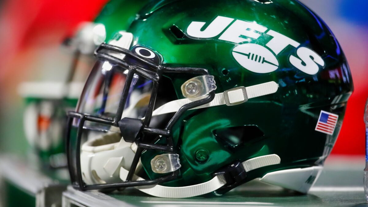
The New York Jets—another organization that can never seem to get, well, just about anything done right—also went with a horrendous, helmet logo that is supposed look futuristic, I guess…
Having the team name written out over a football is boring—and considering the team name is “Jets,” it’s really just a waste of potential.
They could’ve done something neat with wings flanking the sides, like the Eagles did, or they could’ve incorporated a full plane into the logo—instead of a football…
30. Cleveland Browns

I mean… What are we doing here, Cleveland? A plain, rust colored helmet was the best you could do? Especially when they have a couple of awesome alternative logos, like the bulldog and the old school elf guy that they could’ve put on there full-time.
The only reason Cleveland isn’t dead last is the procrastinator in me is giving them bonus points for their extreme effort to mail-it-in on this one.
29. New York Giants
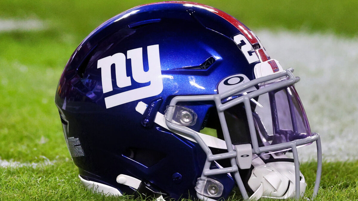
It feels like the Giants helmet logo was an underhanded attempt to try and claim sole ownership of “New York football”—why else would they slap the NY on there instead of something else like, oh—I don’t know—maybe the team name?
They get a slight edge over their neighbors for the attempted power move, but still fall pretty low on the rankings for poor execution.
28. Arizona Cardinals
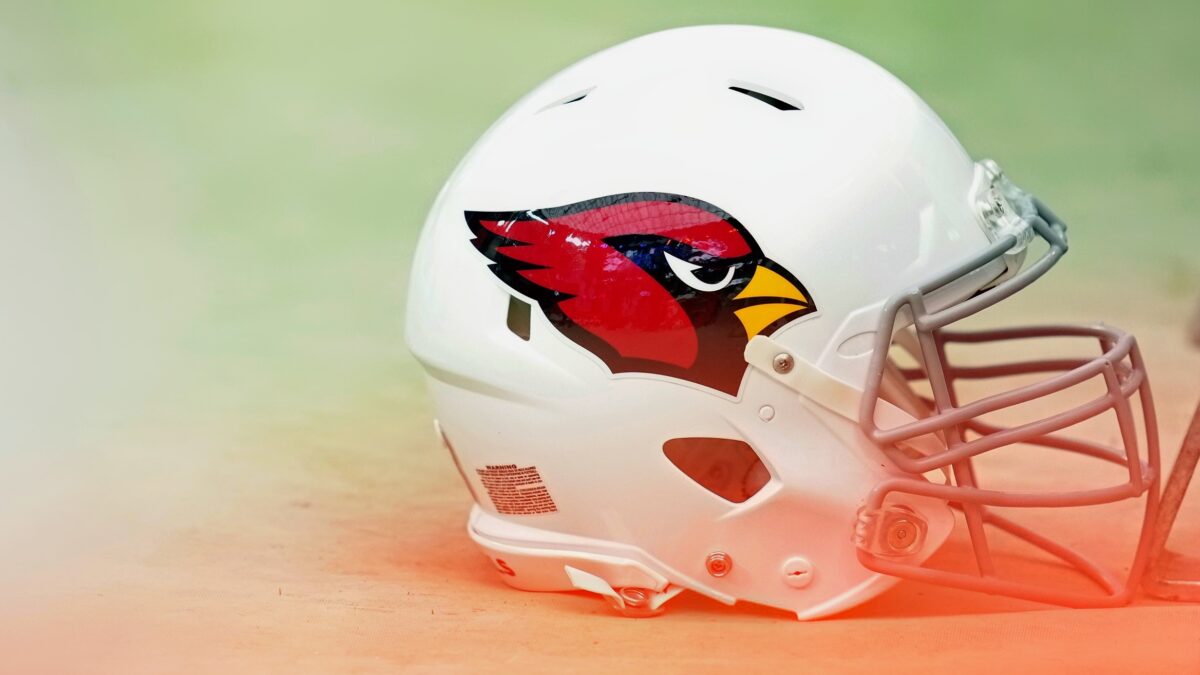
The Cardinals logo isn’t bad. I like that they used the bird itself instead some boring lettering, but they lose a little bit of credit because the logo fails to differentiate itself from the other Cardinal logos across mainstream sports.
It looks exactly like the bird used by Major League Baseball’s Cardinals.
At least Louisville gave its bird a menacing grimace. Sure, giving it teeth doesn’t really make sense biologically, but at least they tried something.
27. Jacksonville Jaguars
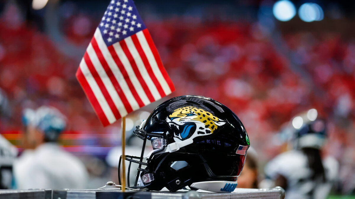
It might just be because I’m so used to watching Jacksonville lose… but that Jaguar on the side of their helmet just looks like a loser. Also, what is the deal with the green tongue? They’re really shoehorning the team colors in there…
26. Houston Texans
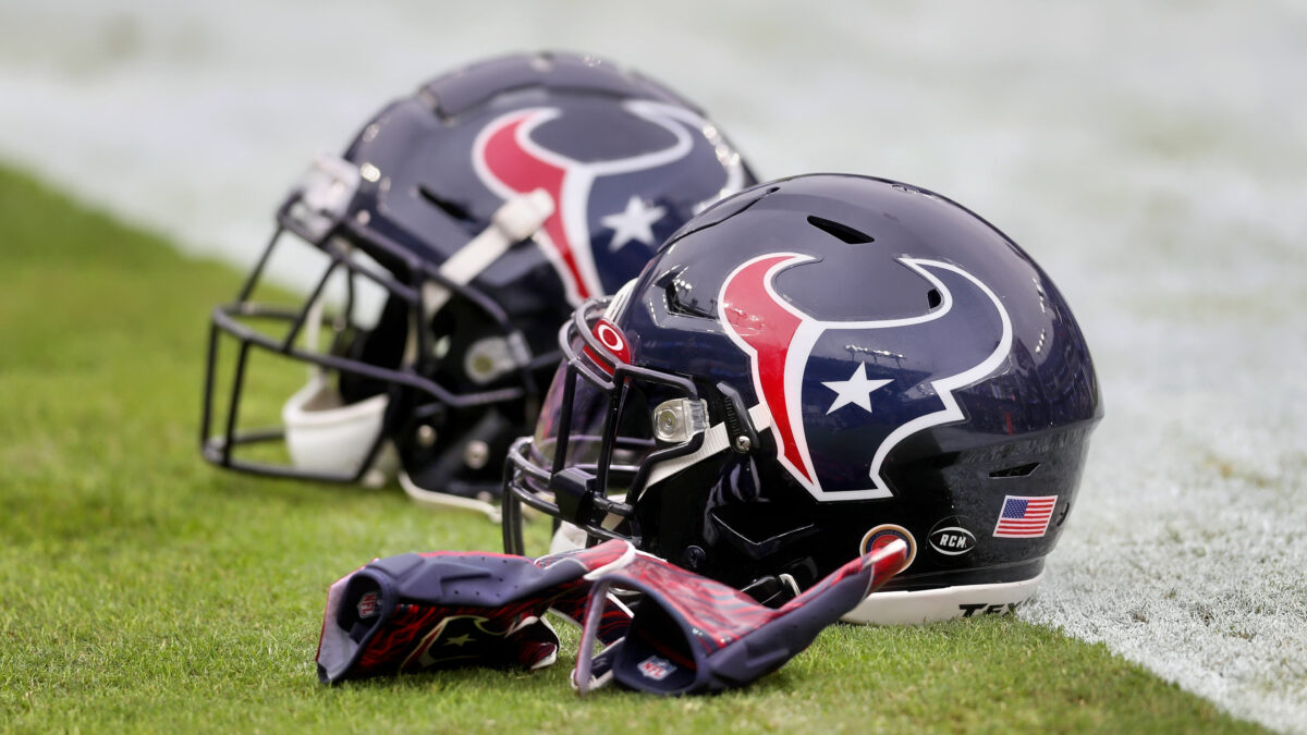
The Texans helmet logo isn’t terrible. It does have that tacky, early 2000s look, but I like the Lonestar for the eyeball.
Really, my main gripe here is that this logo would make a whole lot more sense if they were the Houston Bulls. There is certainly an association between the bull and Texas, but it’s a little too far off the mark for my liking.
25. Denver Broncos
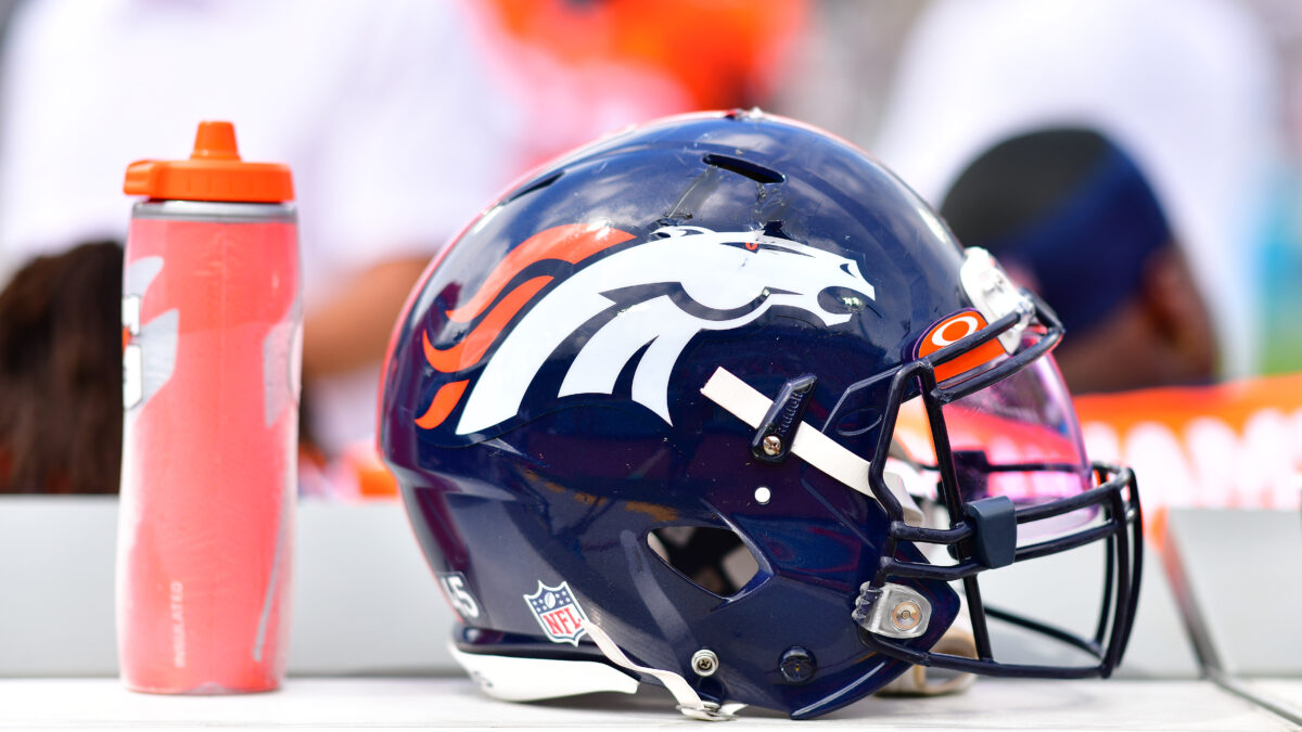
The Broncos’ helmet logo looks like a bizarre horse-robot mash up sent from the future to underwhelm. It definitely also loses points for the fact that it replaced one of the most classic NFL logos.
24. Tennessee Titans
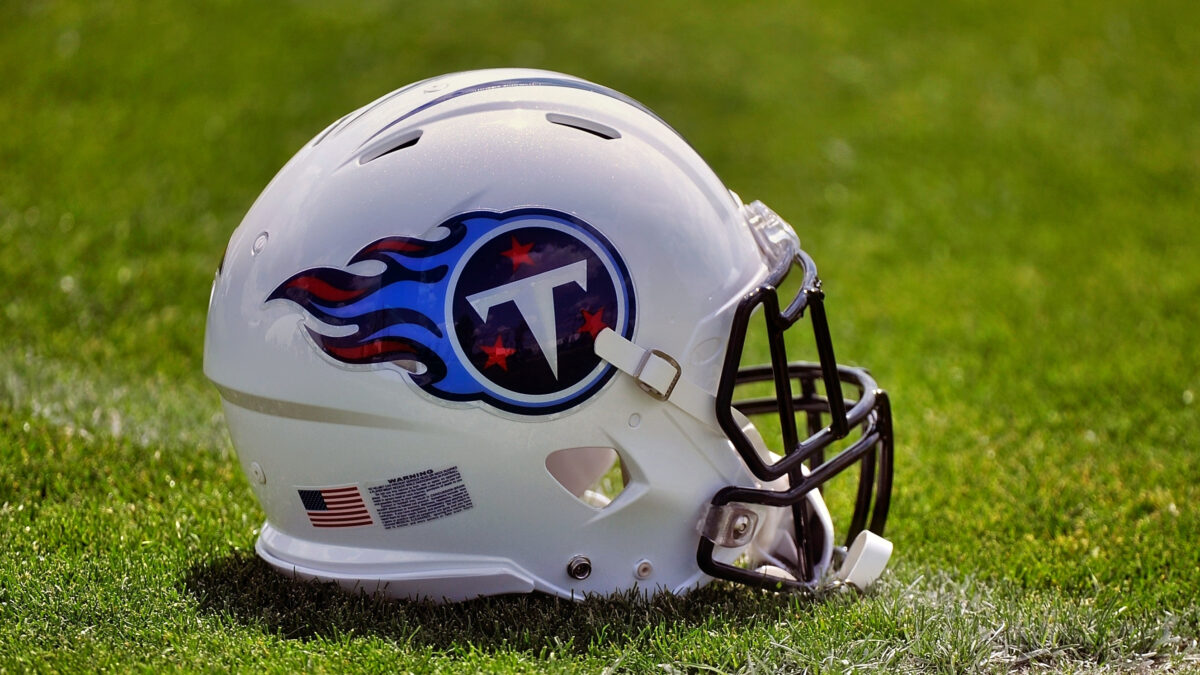
I actually kind of like the Titans logo design-wise—and it’s loaded with symbolism—with the whole sword and shield look that it has going on.
Plus, the logo gets bonus points for having the same colors and stars as the Tennessee flag.
23. New England Patriots
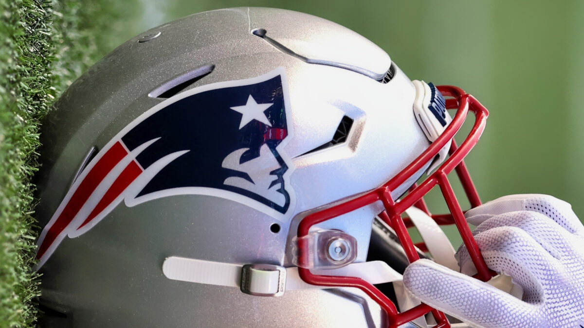
Personally, I am partial to the old school Pats logo—I feel like that one is more representative of the region’s vibe…
But that being said, the current logo is actually a quality design, which, I suppose it should be considering they hired Ken Loh, a famous graphic designer, for the rebrand.
They just get docked a few points because I, like many, got pretty sick of seeing it—along with Brady, Belichick and company—going deep into the playoffs every year.
22. Carolina Panthers
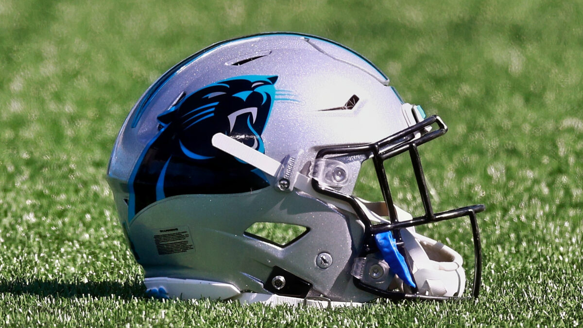
The Panthers have one of the better logos of the recent expansion teams. They did well to avoid that sterile, pseudo-futurist look that Jacksonville and Houston went with.
The sleek, simplistic panther also goes extremely well with Carolina’s awesome color scheme.
21. Miami Dolphins
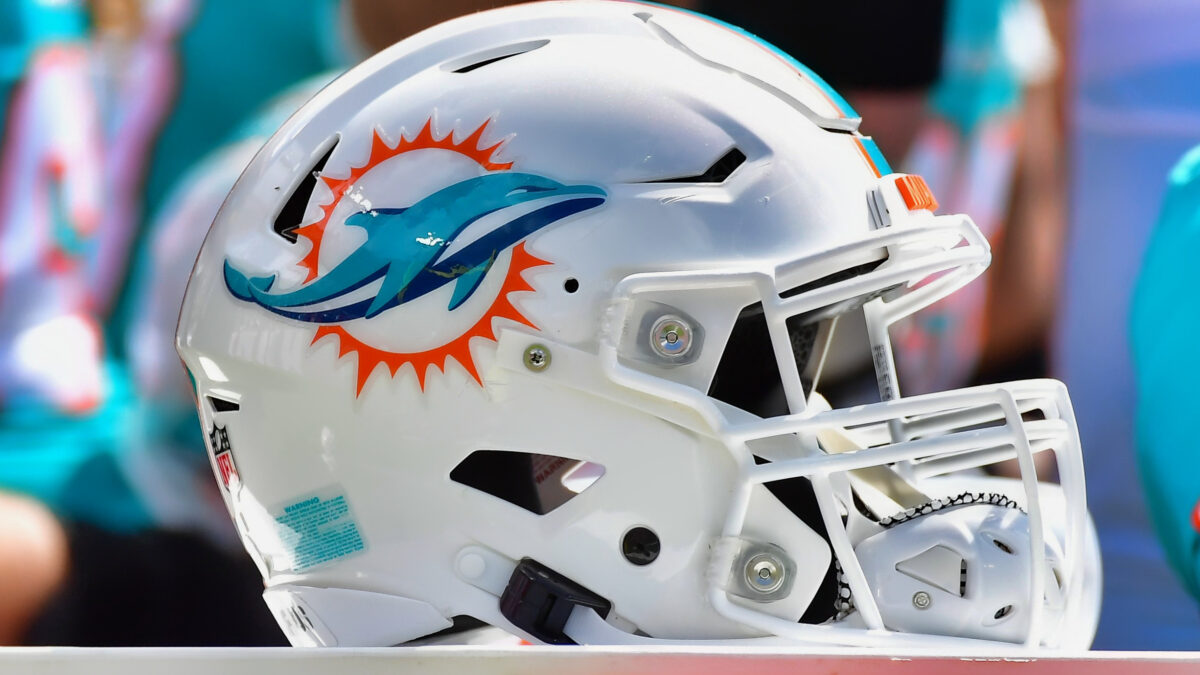
While the Dolphins logo isn’t my favorite—it definitely suits the city of Miami well. The flamboyant orange and teal, with the sun wrapped around the sea creature just screams South Beach.
At least—a family friendly version of South Beach…
If they really wanted to capture Miami’s modern essence, their logo would show the dolphin holding a champagne bottle… or wearing a bikini… or perhaps positioned behind a DJ booth! That being said—I’m not sure Mr. Goodell would go for that.
Actually—I am quite sure he would not.
So, the sunbathing Dolphin lives on!
20. Seattle Seahawks
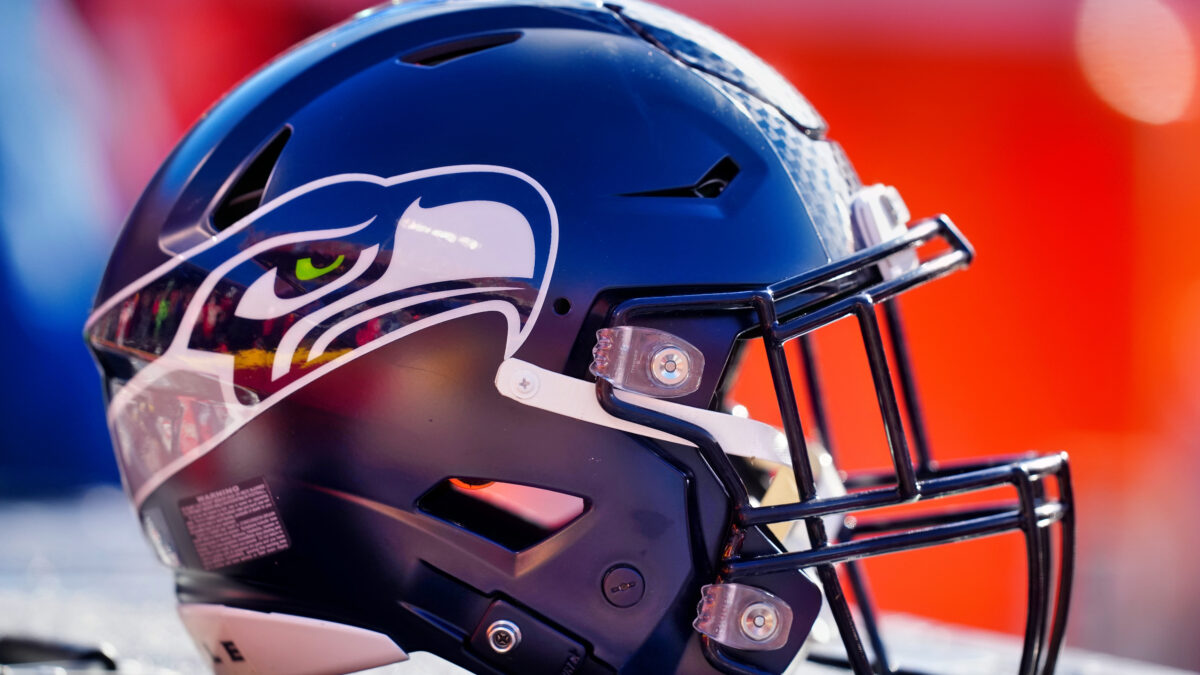
I don’t know why—but for some reason—I can’t shake the feeling that the Seahawk is somehow related to the Bronco on the side of Denver’s helmets—as both share that futuristic, almost robotic animal design.
Despite the two organizations having similarly designed logos—they were actually designed by separate firms.
To Seattle’s credit, I actually like this design a whole lot more than the Broncos’. The color scheme is solid—and it really fits the vibe of the city.
Besides… When you look the Seahawk in the eye—it’s hard to deny that guy means business.
Interestingly, the Seahawks design was actually inspired by a piece of Native American artwork that is on display at the Burke Museum in Seattle.
19. Baltimore Ravens
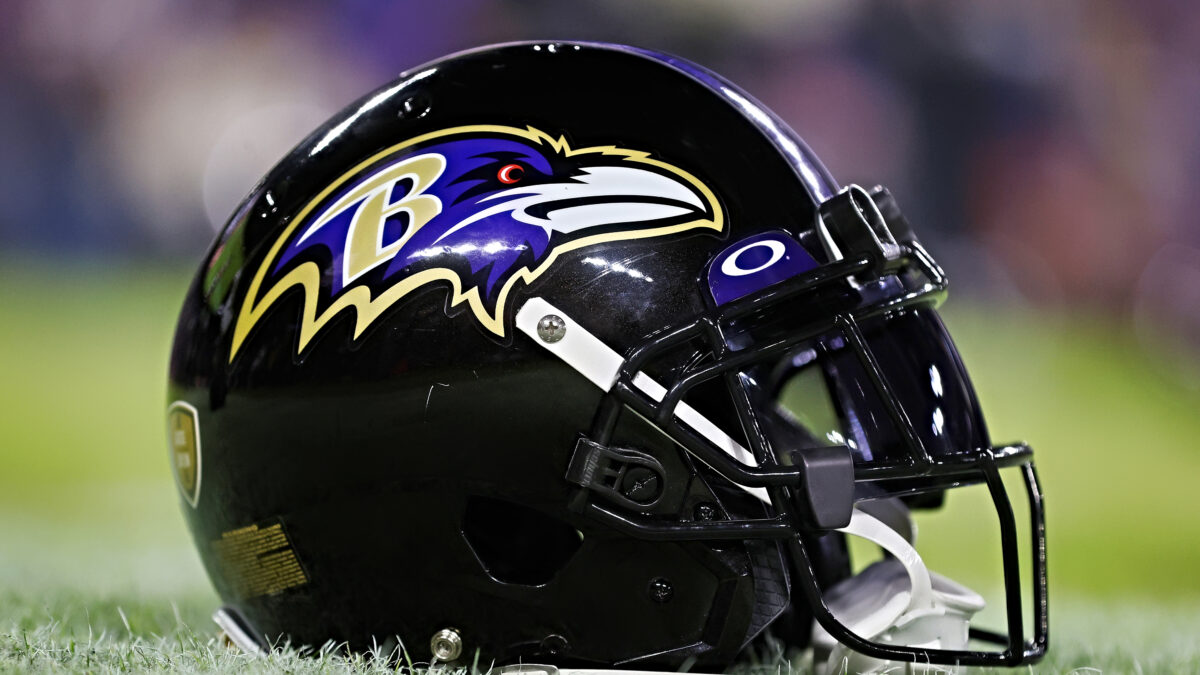
The Ravens’ logo gets some bonus points for having been inspired by the legendary Baltimore writer, Edgar Allen Poe…
I’m not crazy, however, about the way their attempt at realism came out. The Raven has almost alien-like beady eyes and it is honestly a little skeevy the way that it’s feathers flare out.
And what’s going on with the jagged finish along the backside of the logo? Was this Raven decapitated by a jig-saw or something?
As far as the colors go… it is a cool combo, but a little tough to differentiate between the black and the purple if you ask me.
Overall, an extremely mediocre logo.
18. Tampa Bay Buccaneers
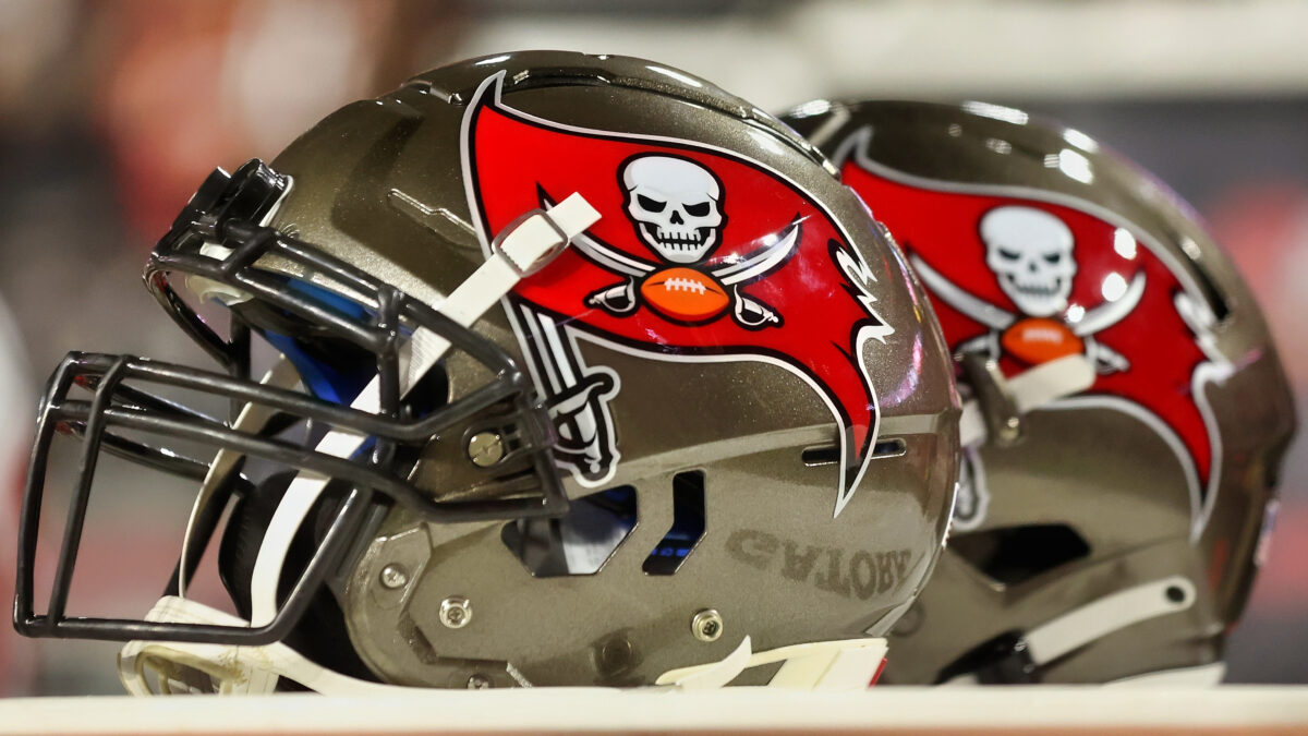
The Buccaneers have a pretty awesome looking design—I mean, the red and pewter is perfect, the skull looks fearsome.… You get the gist.
The problem?
If you ask me—their logo is a little bit of a rip off of the Raiders’ flag.
And to make matters worse, they also punted on having Bucco Bruce—that awesome Pirates of the Caribbean looking guy—as their helmet logo.
That guy had swag out the wazoo—no reason to replace him with a watered-down version of the Raiders logo… but alas!
17. San Francisco 49ers
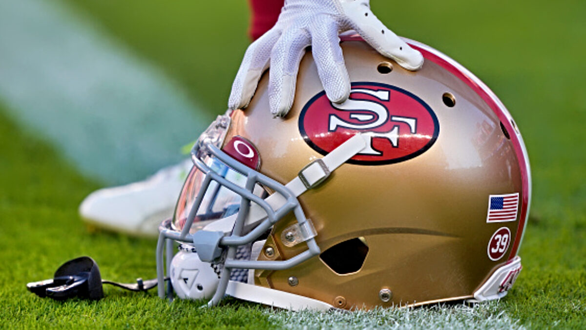
The 49ers helmet logo is ONLY saved by it having defied the odds and establishing itself as one of the NFL’s iconic logos… despite… it not really having all that much going for it in the design department.
I mean… It really doesn’t get much more boring than slapping an S F in the middle of a red oval and calling it a day.
Oh well… Too late to change it now! Don’t expect San Fran to make improvements any time soon.
16. Buffalo Bills
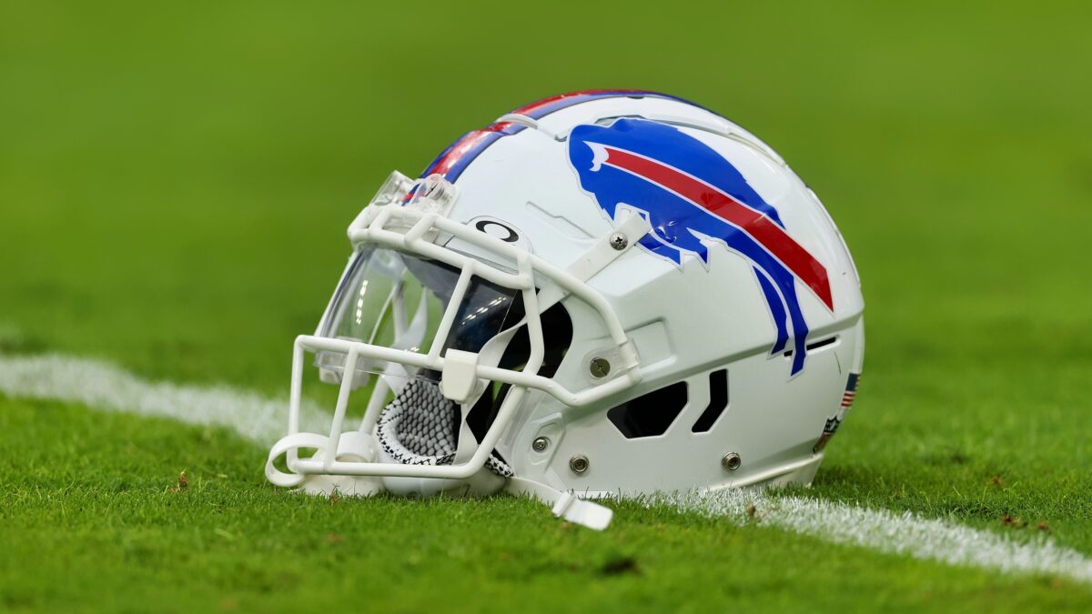
The Bills have an awesome logo… The Buffalo is clearly charging and ready to do DAMAGE. That’s why we haven’t seen all that many changes to the logo over the years… I mean, there have only been two logo changes since the mid 1970s… and all they did was change the coloring in the back drop.
Shout out to Buffalo for not messing with a good thing.
15. Minnesota Vikings
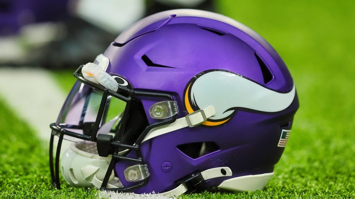
The only thing wrong with Minnesota making its helmet logo Viking Horns—is that the 2-D rendering makes it a little bit tough to even tell that they are horns.
I’m also not a huge fan of the matte purple they’ve turned to in recent years…
I know what they were going for with a more modern palette, but still.
Nevertheless… A lot of potential here! If Minny can tweak the coloring—and make the horns more recognizable—you might be looking at a top five helmet logo.
14. Los Angeles Rams
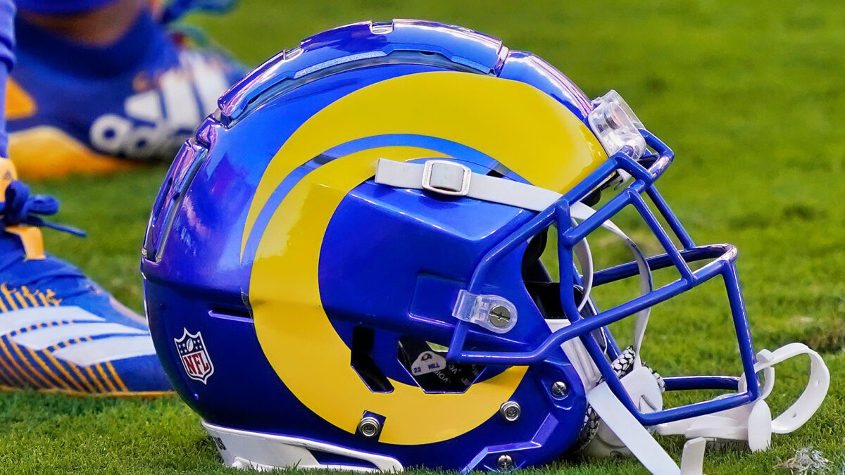
There is something about the Rams logo… I just can’t seem to figure out if I like it or not. Perhaps because you can barely even tell what it is with that abstract, swirly line design.
One thing I know for sure is that it looks WAY BETTER in blue and yellow than it did in blue and white. At least it’s an actual reflection of the team’s colors like this… Even if it’s cut from the same cloth as the indigestibly abstract paintings that became quite the fad during the 2000s.
13. Green Bay Packers

In its own way, the Green Bay Packers’ green and gold is truly one of the most iconic pairings in all of sports, let alone the NFL.
Yes, they contrast in an unconventional borderline ugly way… but when you see them on your screen during a frigid November… or December game—it just feels like football!
After all, they are one of the NFL’s crown jewel franchises… And we’ve seen so many amazing moments take place with that logo dotting the field!
And for that—we can overlook the otherwise clunky looking color scheme. Besides… What else would the Packers do? Slap a big wedge of cheese on the side of their helmet?
12. Chicago Bears
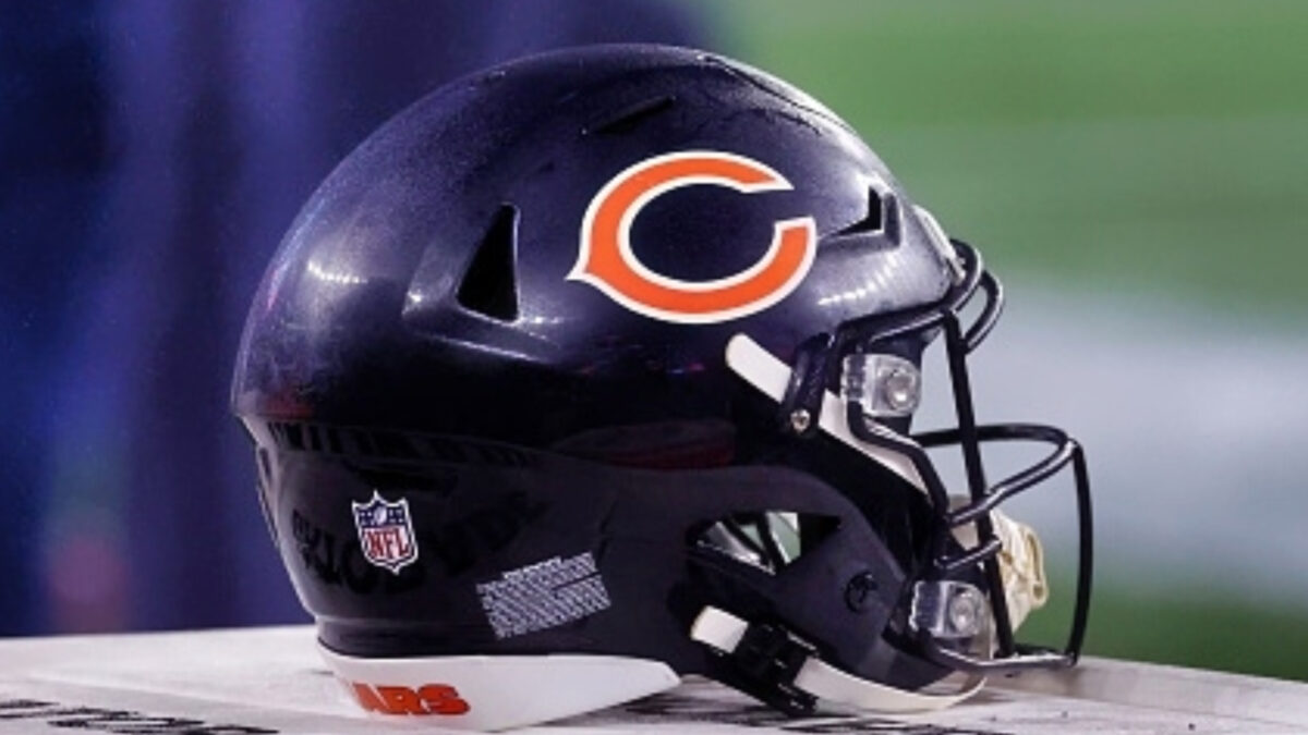
Although the Bears are missing out on a great opportunity to feature a fearsome bear, like they briefly experimented with in the early 90s, Chicago has to get some credit for having one of the more classic logos out there.
It kind of has that ‘ol’ reliable’ feel to it.
Not going to blow you away with glitz and glam, but it deserves its shine nonetheless.
Besides… When I think about Chicago in the winter, that football loving fanbase, and the traditional Bears-style of ground-and-pound, defensive football, that reductionist “C” just kind of makes sense.
11. Dallas Cowboys

Dallas has one of the most iconic logos in pro sports, let alone the NFL… There is no denying that.
It’s a classic.
And it still holds up against the test of time.
10. Las Vegas Raiders
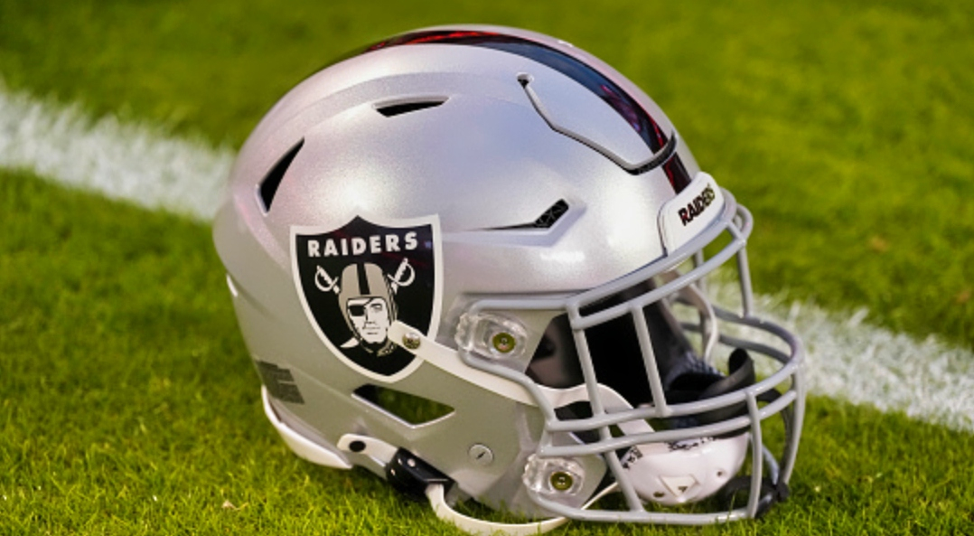
The raider in silver and black—doesn’t get much better than that. Like the Dallas Star, the Raiders have one of the most recognizable logos out there.
In fact, it would probably be a little bit higher on the list if the team hadn’t been ripped out of Oakland… The logo’s lost some of its luster without regularly seeing the psycho blackhole fans wearing it on Sunday morning cutaways.
9. Atlanta Falcons

While the Broncos’ futuristic horse leaves much to be desired, Atlanta nailed it with their logo design. The falcon looks fierce, intense, and powerful.
Now, if only the team could match that energy on the field more often.
8. Los Angeles Chargers
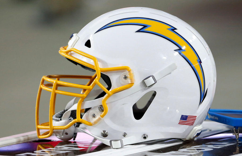
Almost every iteration of the Chargers logo that has ever been done has been awesome. And their most recent is no exception.
The baby blue and yellow—phenomenal.
And the crisp lightning bolt stretching down the side of the helmet…
Truly one of the best designs out there.
7. Pittsburgh Steelers
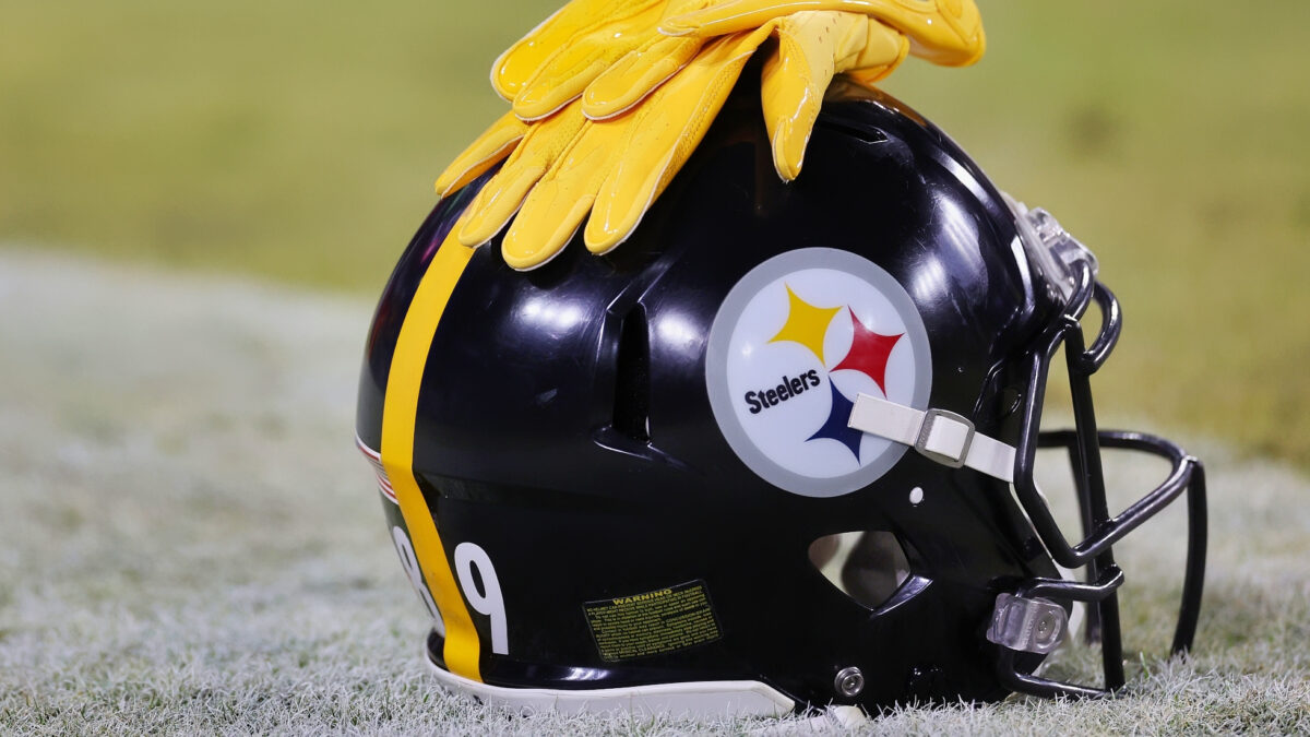
There may be no NFL helmet logo that is more closely tied to the culture of the city than the Steelers’. It pays homage to the industry that built the city—and the team’s fans love it.
Perhaps in part because of how much success the team has historically had with it on.
The Steelers logo is definitely on the shortlist for “never going to change.”
6. New Orleans Saints
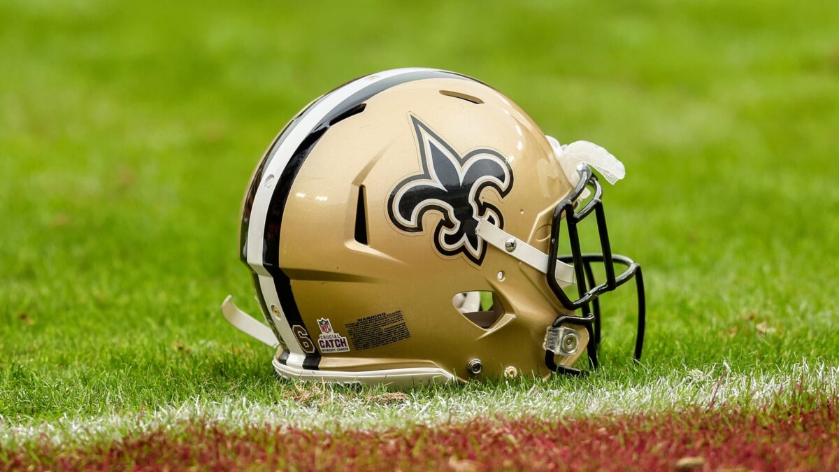
The Saints featuring the fleur de lis is one of the most interesting helmet logos in the game. It’s a strong reference to the city and, frankly, something about it has that unmistakable “cool” factor.
And it fits in with the black and gold brilliantly.
5. Detroit Lions
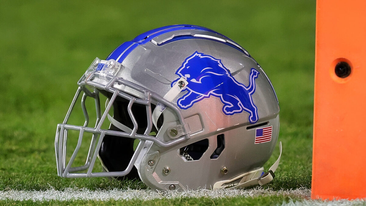
Between the strong design and the color scheme, the Lions have one of the best logos in the league. That silver and blue work.
It’s just a shame that the team hasn’t done right by the logo. Tough to see such a majestic beast beaten down relentlessly over the past 20 years.
4. Indianapolis Colts

The horseshoe is one of the most iconic logos in the NFL—there is no debating it.
I suppose it helps the “cool factor” when you have Peyton Manning lighting up opposing defenses with the Horseshoe on his helmet for 15 some odd years, but nevertheless… the logo is strong enough on its own—and it matches the rest of the uniform perfectly.
Well done, Indy… Well done!
3. Cincinnati Bengals
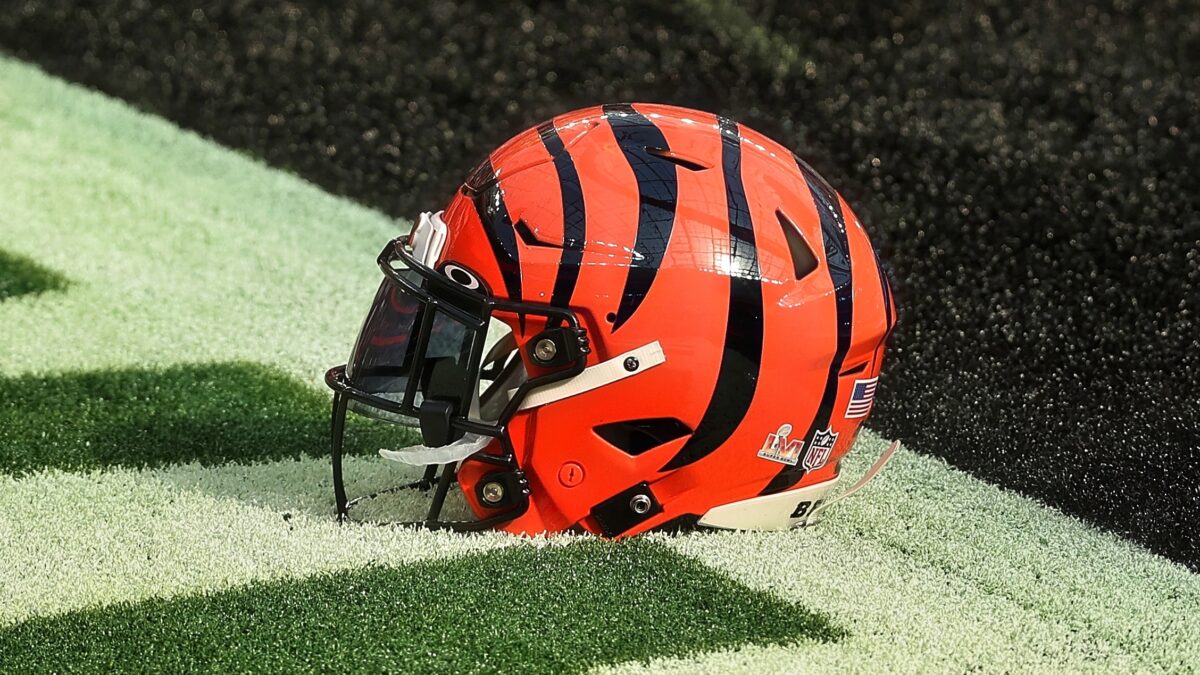
The Bengal stripes are one of the most unique helmet designs in the game—and if you ask me, one of the best.
Not only does Cinci get credit for being creative—they also did a great job of making sure that it didn’t come out tacky or goofy.
2. Philadelphia Eagles
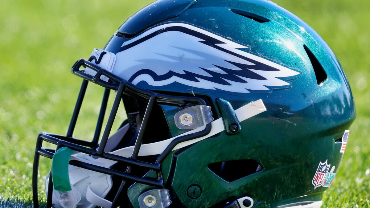
Philly is a tough place to play… It’s a blue collar city, with extremely demanding fans… But at least if you sign on to play for the Eagles, you know that you’ll do so while rocking one of the coolest helmets in the NFL.
It’s subtle, really not over done at all. Just a nice shade of green with two pristine wings running down the side of it.
Simple concept, perfect execution.
1. Kansas City Chiefs

The Chiefs logo is awesome – plain and simple. The arrowhead goes perfectly with the team’s color scheme—and it has excellent synergy with Arrowhead Stadium—where the Chiefs play their home games.
Plus, Kansas City has to get extra credit for being one of the few teams named after Native American culture that didn’t make an offensive cartoon of the people in the process.
Which NFL helmet logo is your absolute favorite?
Ranking All 32 NFL Teams Helmet Logos From WORST To FIRST At The End Of 2023 Season
News Daily Reports


No comments: